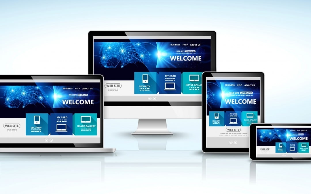
Responsive Website Design
Modern responsive website design is an exciting, and challenging development in the world of websites. But as with all new technology not everything is sunny first time around …
Old website design was traditionally built on fixed dimensions. This means that a website has a fixed width and height and everything on that page had a fixed location. You can imagine this if you think of our place on a map It’s coordinates would never change however you are looking at the map. The old fixed design approach to web design meant was possible to create quite complex layouts with rather basic position. For example: to use a combination of padding and margins, negative and positive,to create complex overlapping elements such as text over the top of an image.
With the evolution of mobile and tablet technology a new approach to Web design had to be found. This new approach is called responsive website design. The key difference with responsive website design is that the elements on the page are all floating. This means Instead of having a fixed position on the page different blocks of text, image or multimedia are positioned In relation to each other. If one of these elements changes then the other elements will change position to.
Planning Your Layouts
When constructing a website a good design should take this into account. It is no longer possible to just think about a single design, one that will work well on a desktop for example. Consideration needs to be given to how the website will be displayed on tablets and mobile phones of various different screen sizes. That can seem overwhelming to begin with but once you have an understanding of how elements move in related each other then you can begin to have some fun and creates truly unique layouts.
The best of get started is to construct a website that work while on a widescreen desk top. Get this right ensures you have a solid foundation for your website before you begin you consider how the layout would be better optimised for tablets and mobile phones. Typically you will find that less content is needed on a tablet or mobile screen than on a desktop. With a few simple CSS rules added you can quickly hide or reposition content that was showing on the desktop make a more streamlined user experience on mobile phones or iPads.
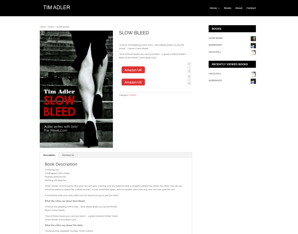
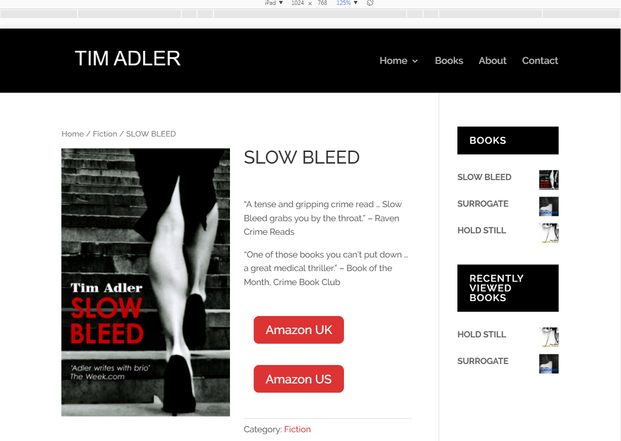
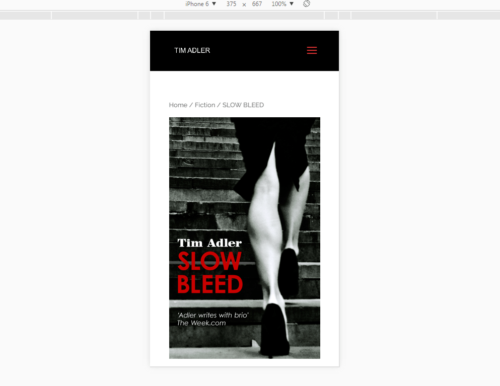
The Stroud Web Design website is a responsive website and it will look different depending on what size screen or type of device you use to view it.
Example of views on three devices:
Desktop
Tablet
Mobile
In summary, responsive web design is an exciting evolution in the world of websites, and with a little bit of for thought you can create unique and user friendly designs which work where ever an however people are viewing your site.